Font Context
Typography clarifies and supports the content and purpose of a work through its form. Their goal is to introduce the reader to the intention of a text. In most cases, an optimal readability of the displayed information is to be achieved, but it can also often be a matter of deliberately highlighting certain information.
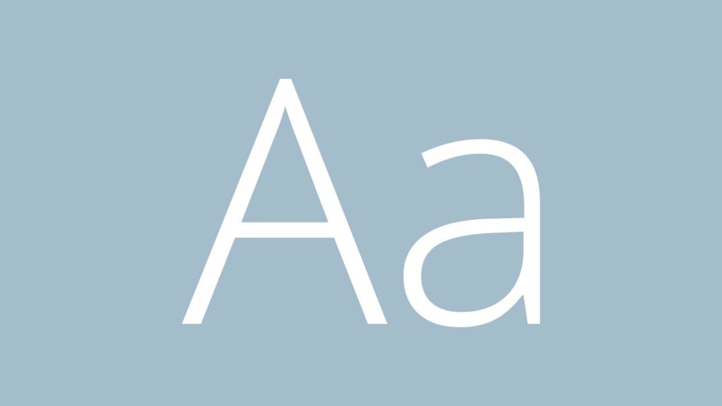

Typeface

Open Sans is a humanist sans serif typeface designed by Steve Matteson, Type Director of Ascender Corp. This version contains the complete 897 character set, which includes the standard ISO Latin 1, Latin CE, Greek and Cyrillic character sets. Open Sans
was designed with an upright stress, open forms and a neutral, yet friendly appearance. It was optimized for print, web, and mobile interfaces, and has excellent legibility characteristics in its letterforms.
Open Sans Regular
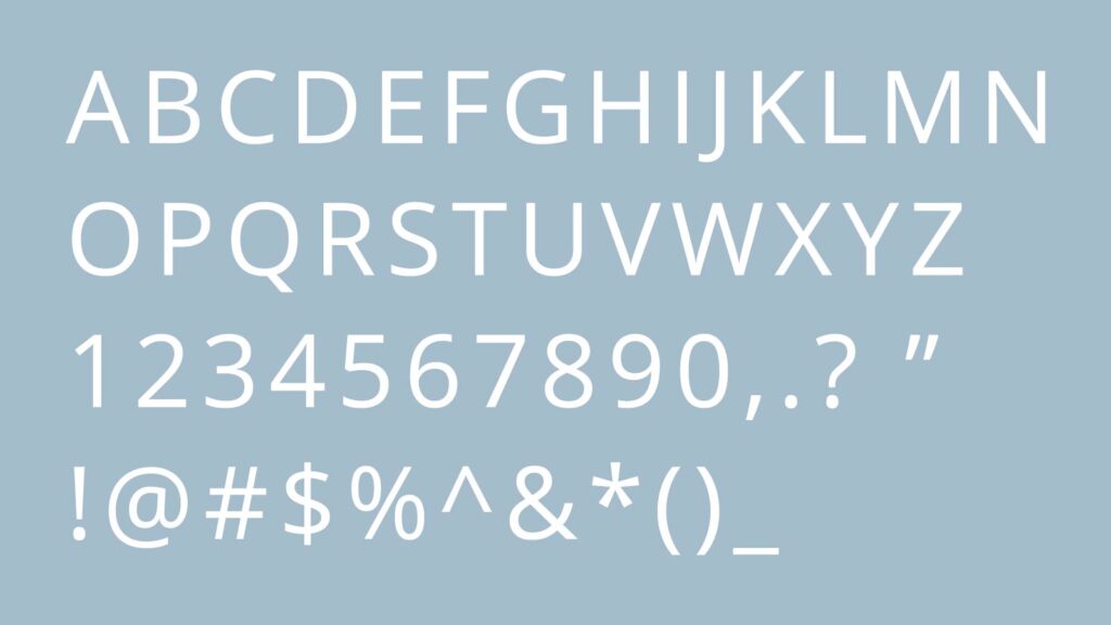

Open Sans Bold
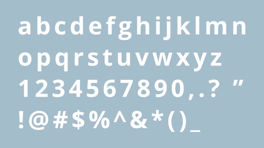

Print and Web
It’s a well known and modern font that is being used more and more on new websites. Because of it’s simplicity it really makes your content
easily readable. The same thing goes for offline content. When printed it will make your documents amazing.
Hierarchy
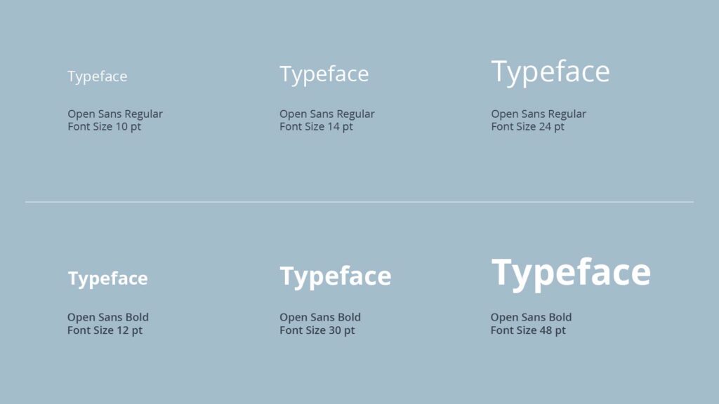
The font Open Sans is used in the font styles Regular and Bold.
Here are the font sizes shown, which should be used.

Scrolling Text
The scrolling text should be comfortable and easy to read. The Open Sans Regular 10 Pt serves as scrolling text.
Subtitles/Highlights
Subtitles should stand out from the scrolling text and catch the eye. The subtitle is the Open Sans
Bold 12 Pt. For highlighting in the scrolling text the Open Sans Bold 10 Pt is used. For quotations the Open Sans Regular 14 or 24 Pt is used.
Title
A title should clearly be read first. The title is the Open Sans Bold 30 or 48 Pt.